D1 Phase 2 -- Basic UI (display only, no edit) (steps 1-22)
Phase 1 was straightforward and easy to verify every step of the way. But setting up the UI (using Workshop) is complicated. That is the main reason this demo:
- Is split into 3 phases (so that you could first complete the relatively easy Phase 1 and then carefully and methodically work through Phases 2 and 3)
- Includes detailed step numbering (in Phases 2 and 3, making it easier to track your progress and identify where something went wrong)
TOC (the heading numbering matches the numbering in the PAL version of this doc):
- Overview diagram (for 6.4-6.6)
- 6.4 Create object table (UI LEFT) (1-2c)
- 6.5 Configure RIGHT selectors and input to LEFT filter (“Create filter”) (3-11)
- 6.6 Create CENTER button label, button, property list (12-22)
Overview diagram (for 6.4-6.6)
Note:
- The numbering 6.4-6.6 is because this phase is sections 6.4-6.6 of my version of the original demo doc (the original was online; my version was a docx (word) file).
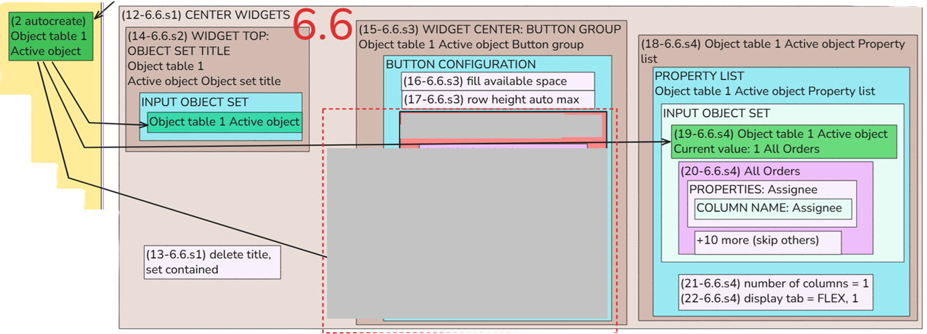
- The step numbering: (12-6.6.s1) means
- Step 12 in this doc.
- Section 6.6 in my docx version (with numbered headings) of the original demo web doc.
- S1 = Step 1 in the original web doc (these were more like Heading 3 sections, not granular steps; for some reason they were numbered but not H1/H2. If you think this is complicated, I agree. But you will discover when you actually do this demo that the diagram below and the numbering are invaluable.
Diagram: 6.4 - 6.6 in phase 2 (8.3 will be covered in phase 3)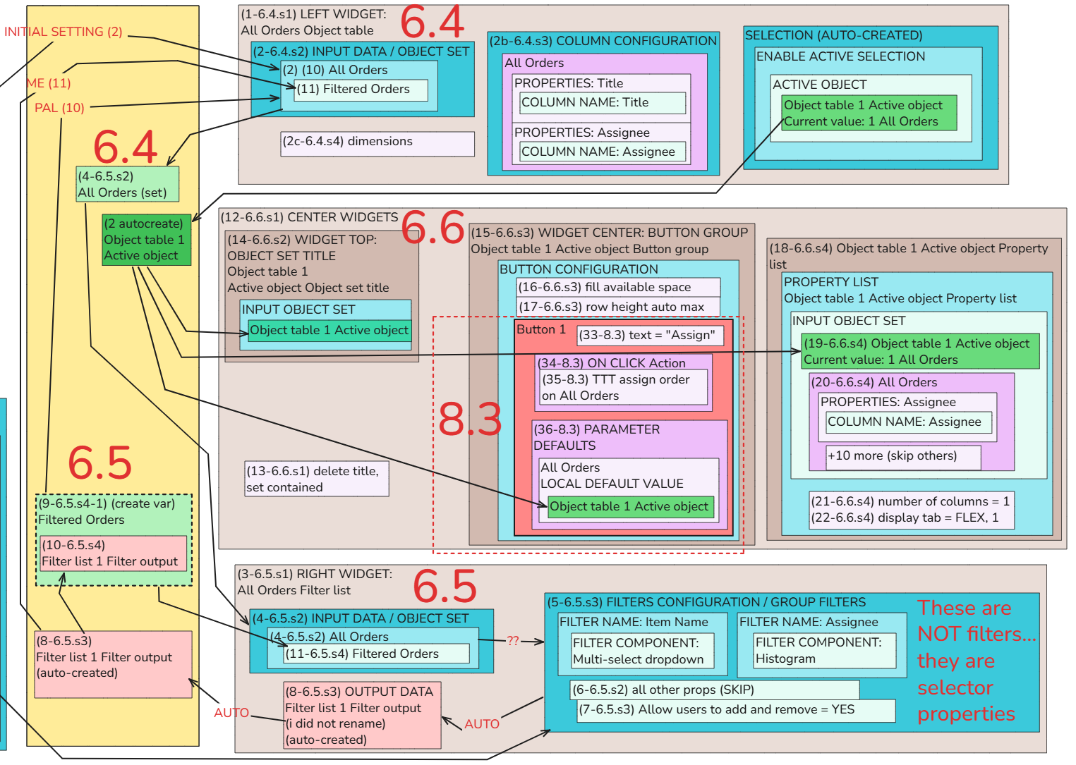
6.4 Create object table (UI LEFT) (1-2c)
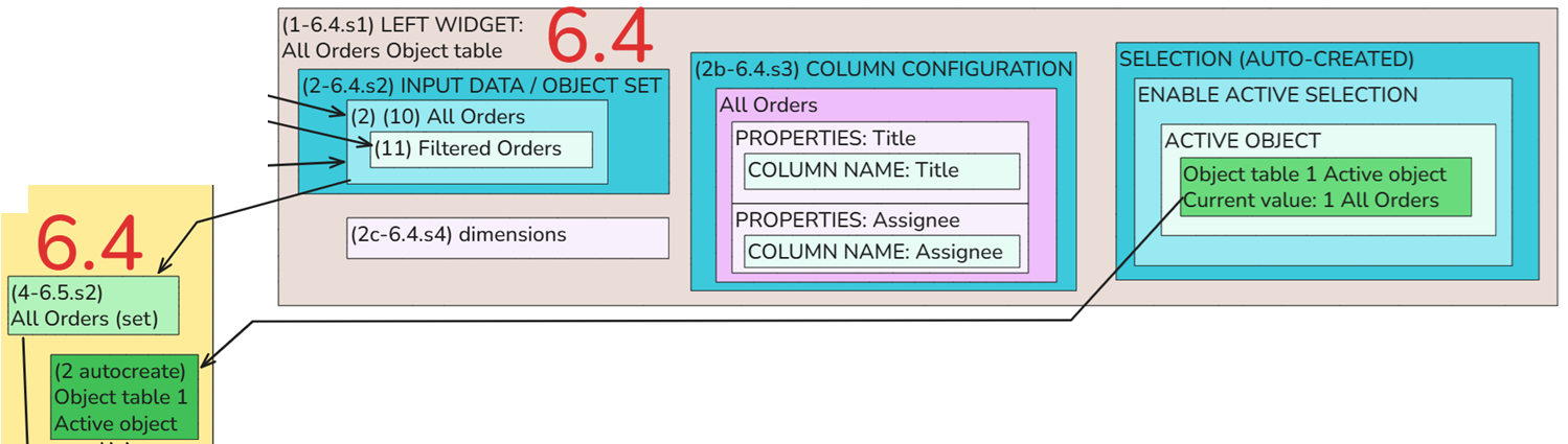
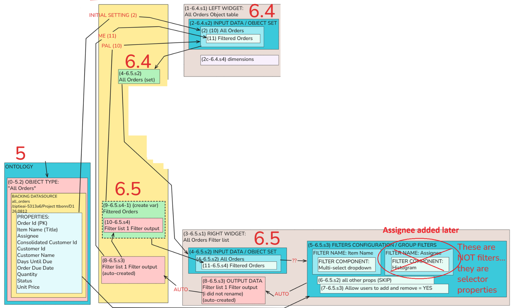
About the diagram above:
- “1-6.4.s1-s2” = This is step (1) in diagrams; section 6.4 in my numbered-headings version of original PAL demo docs; s1-s2 = this was “Step 1” and “Step 2” in PAL docs.
- In (10) and (11) you modify these settings.
- I will add detail text about each dialog and step later.
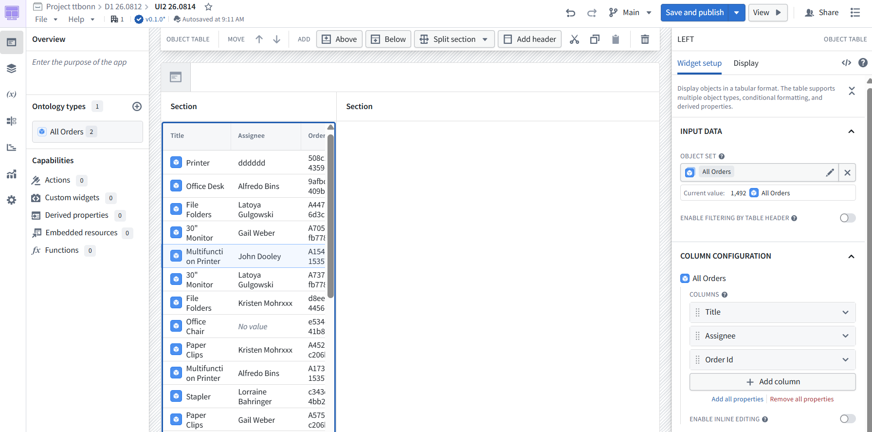
Add: (1-6.4.s1) LEFT WIDGET: All Orders Object table.
Specify: (2-6.4.s2) INPUT DATA / OBJECT SET
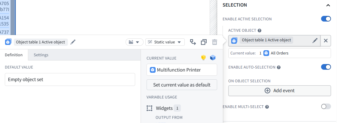
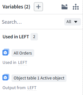
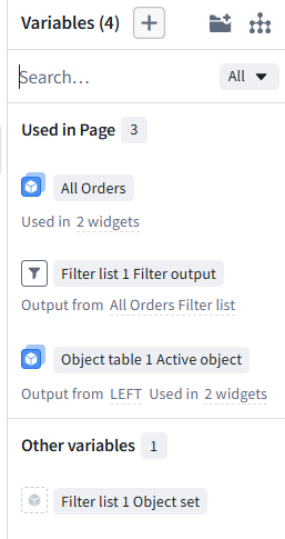
Note the auto-created variables.
6.5 Configure RIGHT selectors and input to LEFT filter (“Create filter”) (3-11)
This is where things get complicated. You need to study carefully how this is done and repeat several times. I disagree with the UI terminology (I think thats the main source of my confusion when doing this demo).
TOC:
- FDE/GPT-5.5 summary of the “property selector” (Filter) naming issue
- 6.5.1 Configure RIGHT property selectors
- 6.5.2 Input property selectors to LEFT FILTER to display only specified property columns
FDE/GPT-5.5 summary of the “property selector” (Filter) naming issue
In Workshop, "Filter List" is ... not “the thing that filters the table” by itself.
- Filter List widget = UI control that produces a filter variable
It lets the user choose property/filter criteria.
Then the actual filtering happens only if:
Filter List output variable
→ is used by filtered object set
→ table reads that filtered object set
So the real chain is:
Filter List widget
selects filter criteria
→ outputs filter variable
→ filtered object set applies filter
→ object table displays result
Better name would be:
Filter Selector
or:
Filter Control Widget
The name hides the actual mechanics.
6.5.1 Configure RIGHT property selectors
Add: (3-6.5.s1) RIGHT WIDGET: All Orders Filter list.
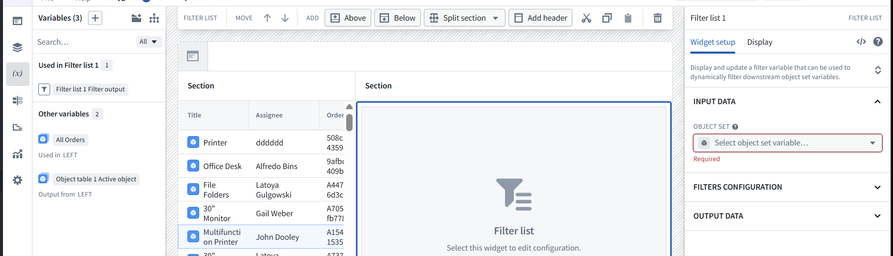
Specify: (4-6.5.s2) INPUT DATA / OBJECT SET.
Specify: (4-6.5.s2) All Orders.
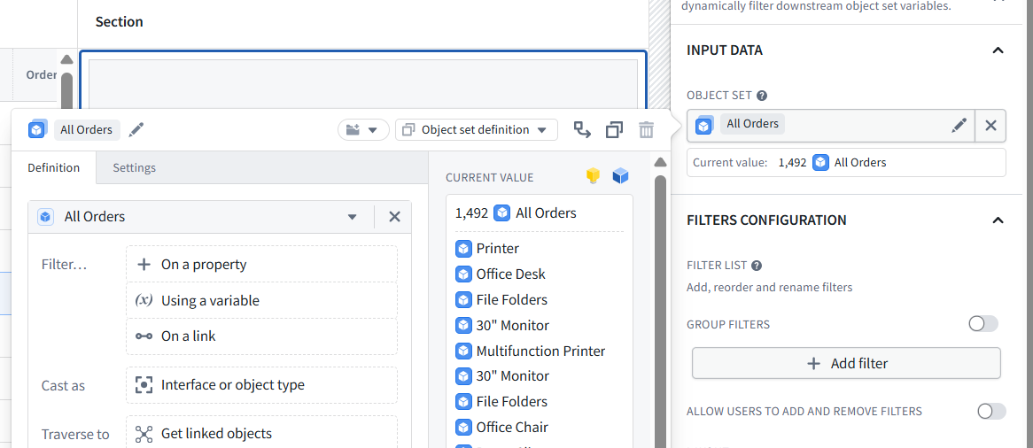
(5-6.5.s3) FILTERS CONFIGURATION / GROUP FILTERS
NOTE: These are called filters, but they are property selectors. You are specifying the properties that will be sent to LEFT list (used by filters in that list component).
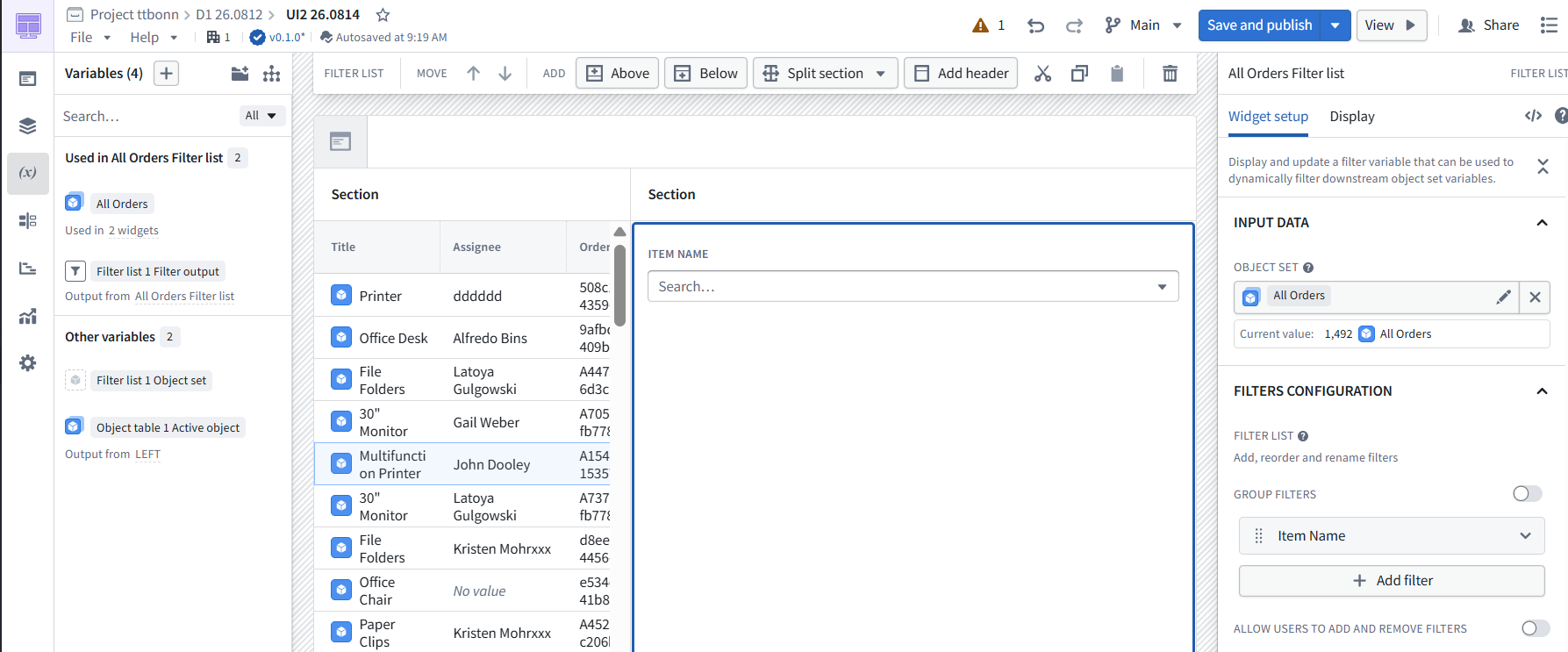
(6-6.5.s2) all other props (SKIP)
(7-6.5.s3) Allow users to add and remove = YES

(8-6.5.s3) OUTPUT DATA Filter list 1 Filter output
(i did not rename) (auto-created)
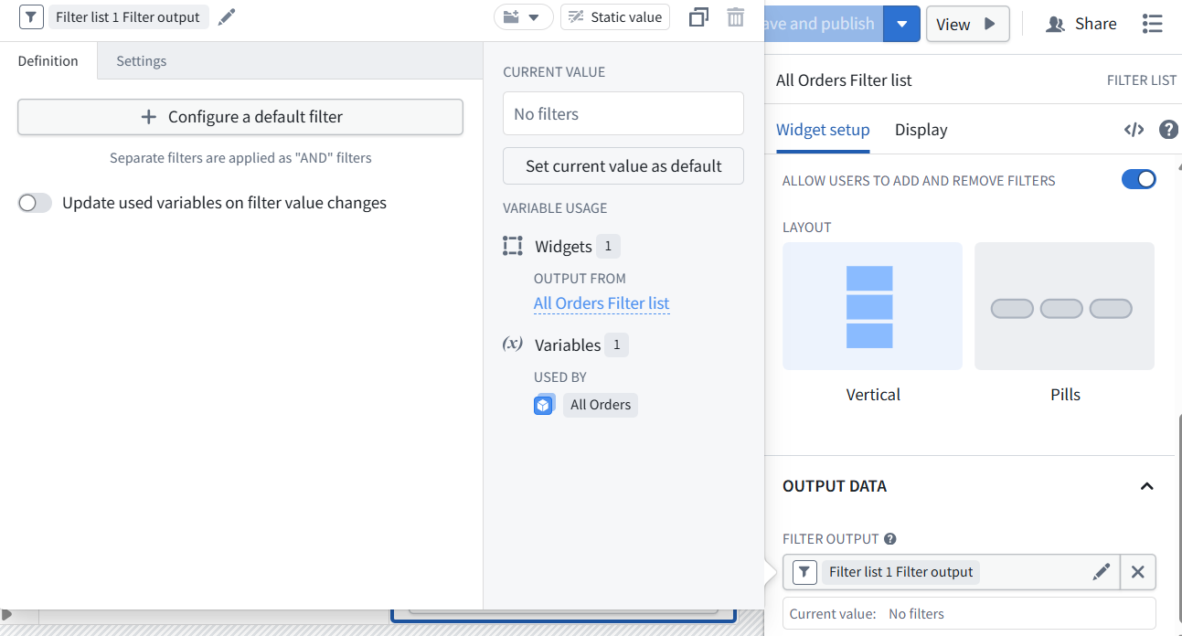
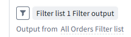
Auto-added In Variables panel.
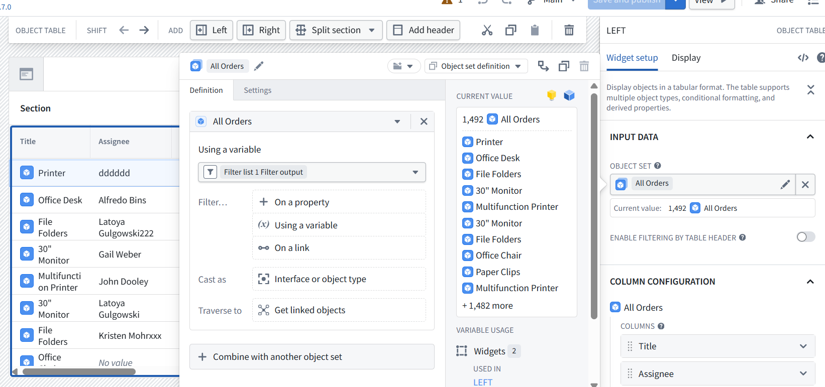
6.5.2 Input property selectors to LEFT FILTER to display only specified property columns
The filter is in the LEFT panel (Not in the RIGHT panel; this is only a property SELECTOR).
- NOTE: The PAL version created a variable (9-6.5.s4-1) (create var) Filtered Orders. I did not.
Specify the RIGHT selector inputs for the LEFT filter: (10-6.5.s4) Filter list 1 Filter output.
6.6 Create CENTER button label, button, property list (12-22)
TOC:
- 6.6.1 Add CENTER section
- 6.6.2 Add CENTER-TOP title
- 6.6.3 Add CENTER-MIDDLE button
- 6.6.4 Add CENTER-BOTTOM Property List
6.6.1 Add CENTER section
Set flex 2
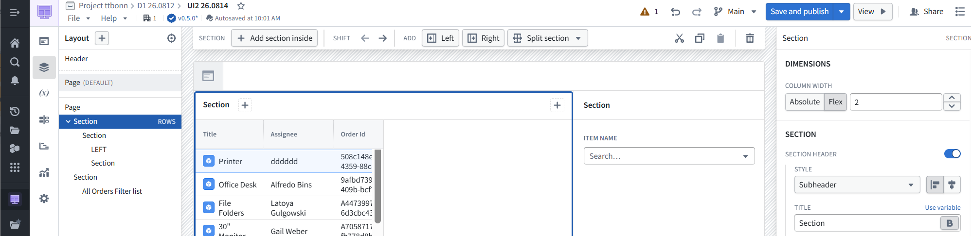
(12-6.6.s1) CENTER WIDGET
(13-6.6.s1) delete title, set contained
<img src=”/assets/D1/D1_217.png” alt=”xxx” width=70%” style=”border: 1px solid #999;”>
6.6.2 Create CENTER-TOP title
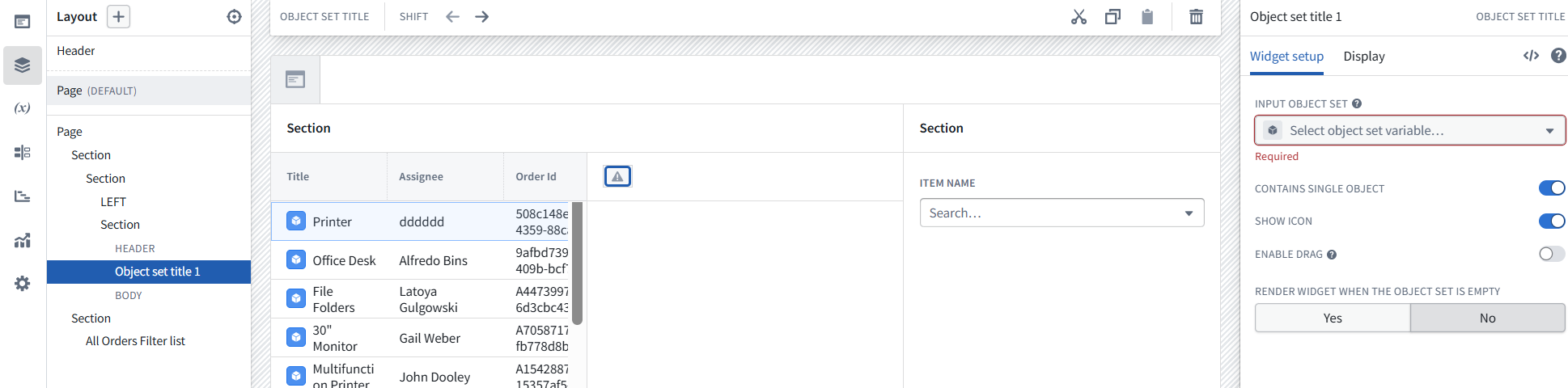
(14-6.6.s2)
- WIDGET TOP: OBJECT SET TITLE = Object table 1 Active object Object set title
- INPUT OBJECT SET = Object table 1 Active object
This is the Title property for the currently selected LEFT object.
6.6.3 Create CENTER-MIDDLE button
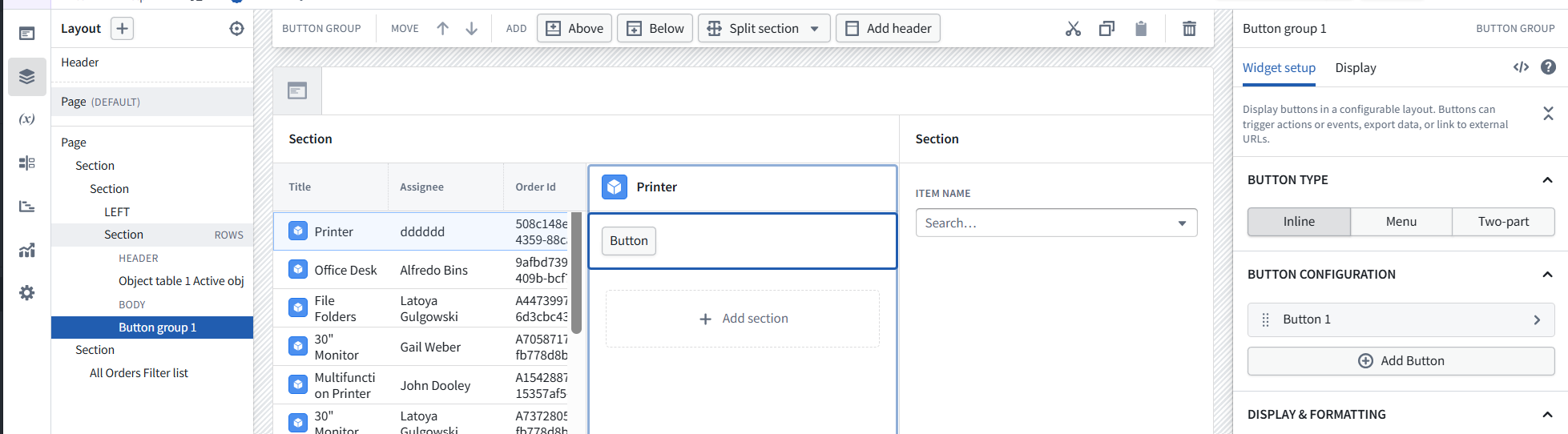
s3 Button group will be used later after 7 “assign action” created.
- (15-6.6.s3) WIDGET CENTER: BUTTON GROUP = Object table 1 Active object Button group
BUTTON CONFIGURATION
- (16-6.6.s3) fill available space
- (17-6.6.s3) row height auto max

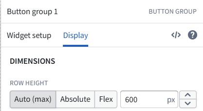
6.6.4 Add CENTER-BOTTOM Property List
(18-6.6.s4) Add PROPERTY LIST = Object table 1 Active object
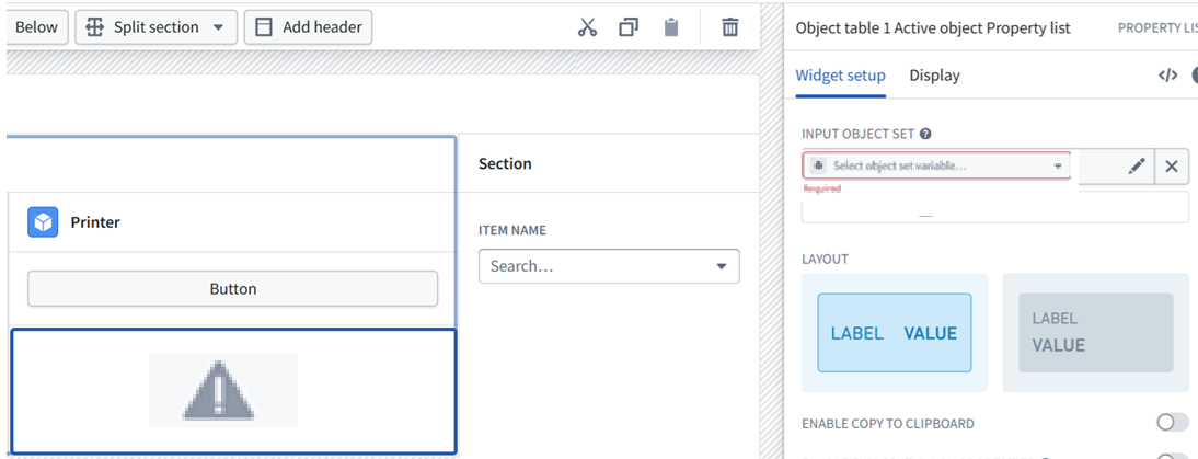
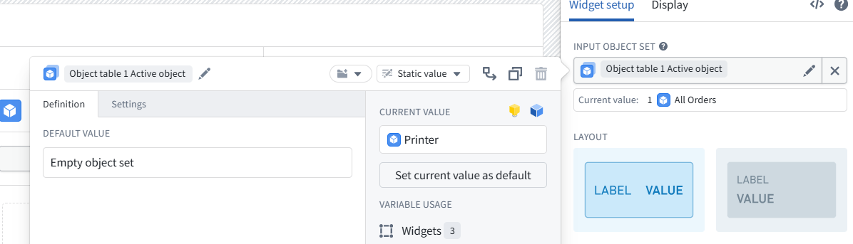
(19-6.6.s4) Add INPUT OBJECT SET = Object table 1 Active object.
Current value: 1 All Orders
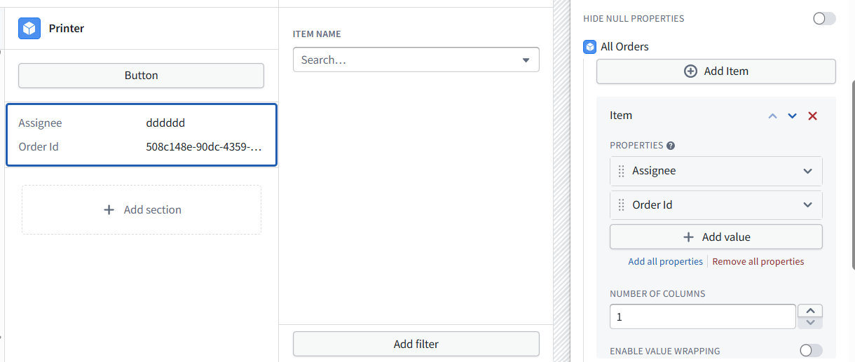
(20-6.6.s4) Add “All Orders” items
- PROPERTIES: Assignee / COLUMN NAME: Assignee
- PROPERTIES: Order Id / COLUMN NAME: Order Id
(dont bother adding the other 9 properties)
(21-6.6.s4) number of columns = 1
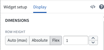
(22-6.6.s4) display tab = FLEX, 1
Phase 2 final test
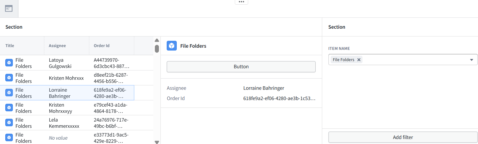
- 1 RIGHT panel: Select Item (object) Name. LEFT panel shows only such items (objects).
- 2 LEFT panel: Select item (object).
- 3 CENTER panel: Shows details of selected item (object).
26.0818 (v1 26.0816)